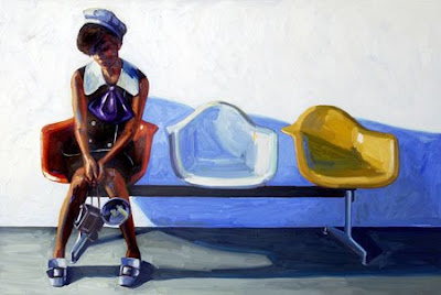
I don't talk a great deal about painting on here, but I am a fan. I have a nice little collection (considering my age and income level, that is) of paintings, but I am also very, very picky. That said, I've just fallen in love with
Kelly Reemtsen's art, and I'll tell you why.


To begin with, there's the subject matter. As such a huge fan of mid-century furniture and other retro ephemera, I love seeing it painted so well. Maybe I can't find or afford a
Saarinen tulip chair or
Eames rocker, but the paintings are charming and don't take up much space (see top photo).

Next, there's her vibrant use of color. The saturated hues combined with the retro subject matter give an unreal, nostalgic feeling, rather like the memories of a long-ago summer.


Finally, there's her use of space. The unrelenting use of white (she'll often use an entire tube of white oil paint in one piece) and generous negative space are broken only by the ground (an unobtrusive beige) or a shadow, and serve to make the subject pop. Her vibrant colors just serve to enhance the overall composition.


There you have it.
Kelly Reemtsen combines retro subject matter with vibrant, saturated color and generous white negative space and the end result is a painting I wish I could step into. There doesn't appear to be a way to buy her works online, but she's
listed with
Caldwell Snyder Gallery in San Francisco, and you can view a
selection of her works there.
 via Design FormuLA, photos also from here and here
 I don't talk a great deal about painting on here, but I am a fan. I have a nice little collection (considering my age and income level, that is) of paintings, but I am also very, very picky. That said, I've just fallen in love with Kelly Reemtsen's art, and I'll tell you why.
 To begin with, there's the subject matter. As such a huge fan of mid-century furniture and other retro ephemera, I love seeing it painted so well. Maybe I can't find or afford a Saarinen tulip chair or Eames rocker, but the paintings are charming and don't take up much space (see top photo).
 Next, there's her vibrant use of color. The saturated hues combined with the retro subject matter give an unreal, nostalgic feeling, rather like the memories of a long-ago summer.
 Finally, there's her use of space. The unrelenting use of white (she'll often use an entire tube of white oil paint in one piece) and generous negative space are broken only by the ground (an unobtrusive beige) or a shadow, and serve to make the subject pop. Her vibrant colors just serve to enhance the overall composition.

 There you have it. Kelly Reemtsen combines retro subject matter with vibrant, saturated color and generous white negative space and the end result is a painting I wish I could step into. There doesn't appear to be a way to buy her works online, but she's listed with Caldwell Snyder Gallery in San Francisco, and you can view a selection of her works there.
 via Design FormuLA, photos also from here and here

No comments:
Post a Comment